Redesigning Simple’s Visual Identity
Visual identity redesign for Simple, an independent creative marketing agency for Business and bold Founders.
Our challenge
Create a bold and memorable visual identity that embodies Simple’s mission.
Translate the brand’s personality into design elements that convey simplicity, performance and results.
Design adaptable assets for both digital and print applications to ensure scalability and flexibility.
Symbolism and Functionality
The forward-leaning “i” and the ball as a Logo & Brand Artifact
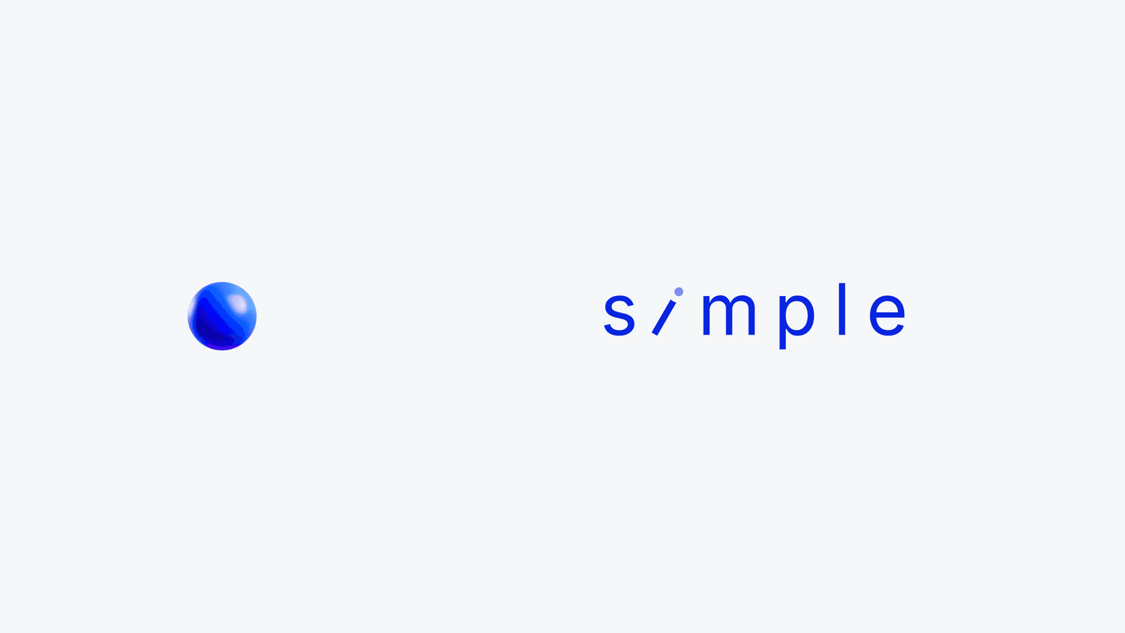
A key element of Simple’s visual identity is the “dot” of the forward-leaning “i,” which has been transformed into a versatile brand artifact, the simple ball. This design choice is a visual metaphor for the agency’s core values – simplicity, collaboration, and adaptability- while enriching the overall identity with dynamic and engaging applications.

Symbolism and Functionality
SimplicityThe dot, represented as a “ball,” reflects the agency’s promise to simplify complex marketing challenges and make them approachable and actionable.
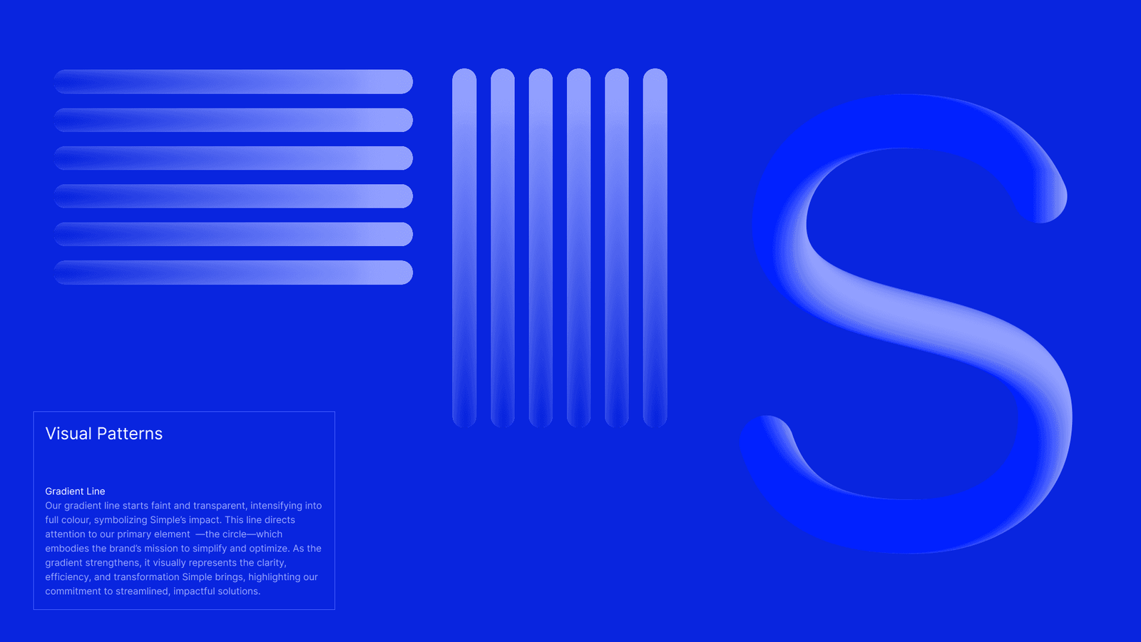
CollaborationThe ball’s movement in graphic assets symbolizes teamwork and the dynamic exchange of ideas, mirroring Simple’s consultative and partnership-driven approach to marketing.AdaptabilityDesigned to be flexible, the ball can be incorporated across diverse contexts, from visual patterns to standalone brand symbols, ensuring that the identity remains cohesive and scalable.

Creative Applications

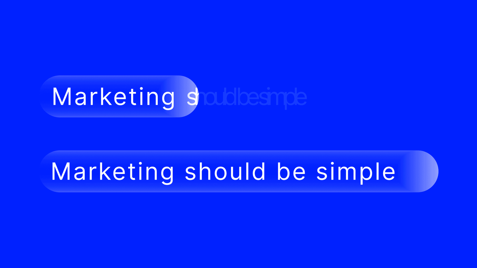
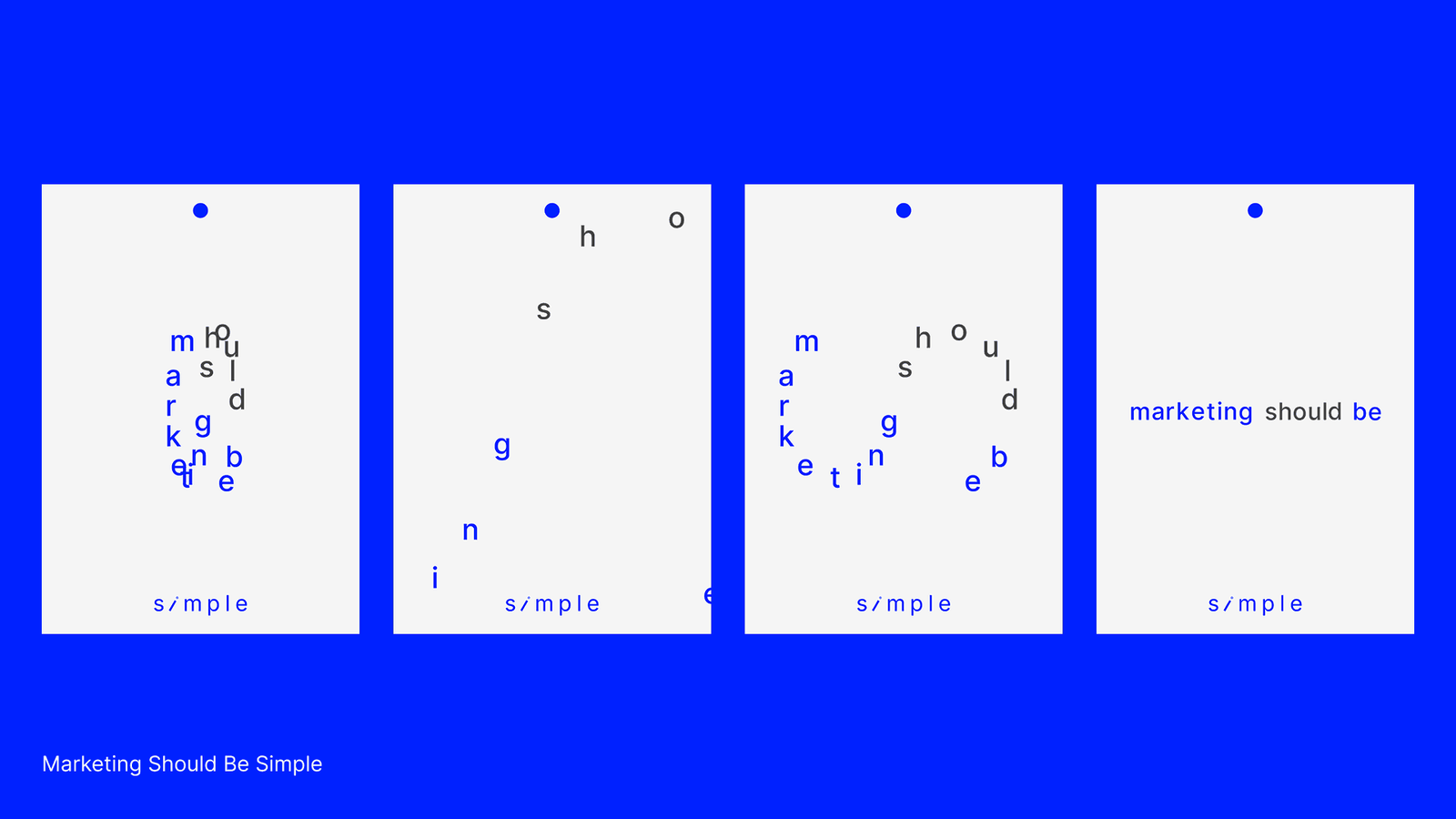
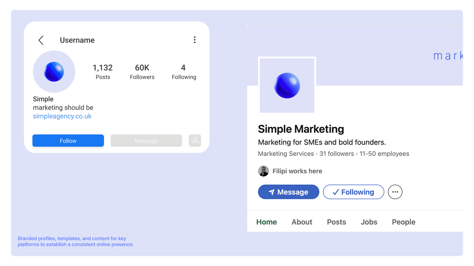
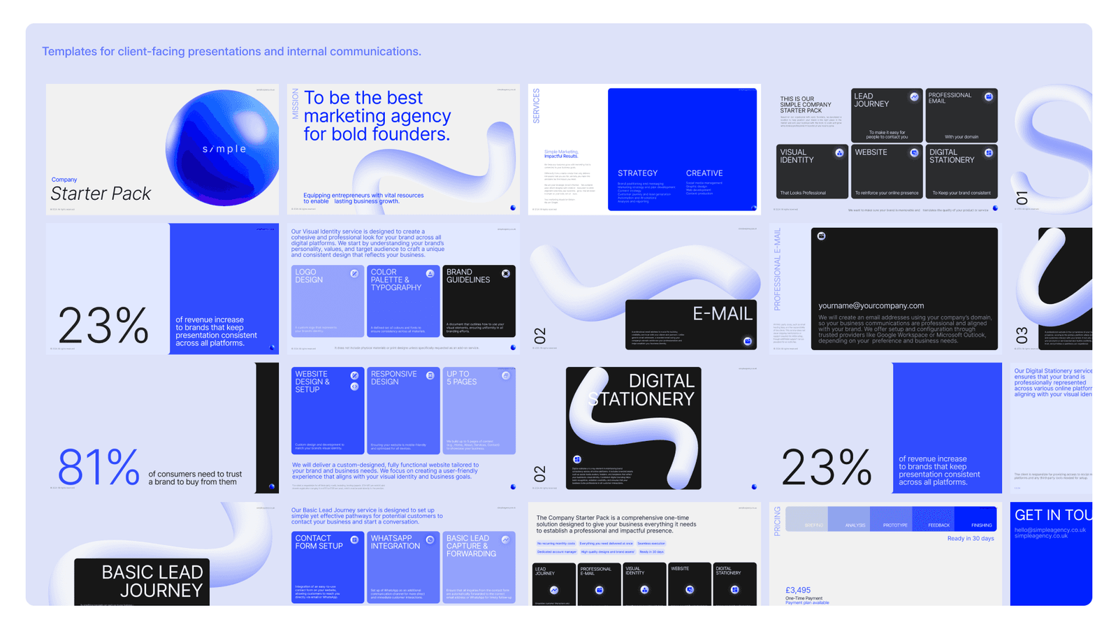
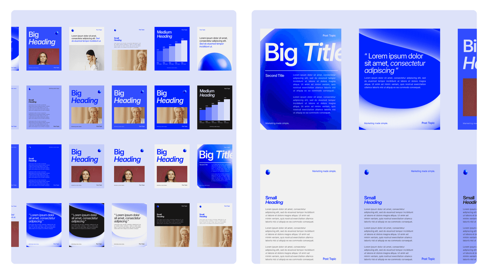
As a newly rebranded agency, Simple is actively integrating its visual identity into broader applications. While the project has yielded promising results, the brand remains committed to refining and expanding its digital assets.